
Photo by divemasterking2000
I want a redesign. I need it to be forward thinking with easy access to most sections of the site. Although this sounds like I’m trying to sell something to a client, please bare with me. Creating an effective landing page (in my case the front page) is a must. This is not a tutorial, but a discussion, a way to put into perspective several elements of effective web-design. I’ll analyze a few blogs and web-sites that make good use of their front page and try to draw some conclusions that will help me in my own quest towards a full redesign.
There are several flaw in the current design, conceptual and technical. Technically there are some issues with IE that simply annoyed me to the point that I just ignored them. I want to integrate threaded comments and the footer isn’t exactly what I would like it to be. Also, I never got a chance to update to the latest Thematic version on which this blog is built because I didn’t need any of the new features. The content I had was simply happy with the current design.
From an usability point of view there are bigger problems with the design. Right now the articles are accessible through a right column with nothing but text and to be honest it looks like a big blurb. I want a better way to differentiate my categories, WordPress Themes and the services page.
To make it clearer this is what I want to achieve with this new redesign:
- Better navigation
- Easy access to all of the content
- Article suggestion at the end of each post
- Pixel perfect in all modern browsers
- Instant understanding of what this blog is about by new visitors (tough an about widget perhaps?)
- A more useful footer. This should be a place where one can find other info site related and introduce the visitor further inside the website
Inspiration
I’ve browsed around for ideas. Seeing and analyzing how others have solved their problems will help me come up with my own solutions for the content I have. There are quite a lot of websites and blogs that have really good content design and this is really important if you want your users to stay more on your website.
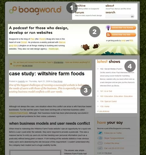
1. http://boagworld.com/ – Boagworld is the blog of Paul (the Wurzel) Boag who lives in the heart of rural Dorset. He produces a weekly podcast with Marcus (pop star) Lillington on all things relating to building and running websites.
What I found interesting were 4 areas:
- The main menu. It’s one of the first things you see when you enter the website. The fact that it has only 4 elements (and one of them the search box) means that they removed a possible home link or a contact link thus giving more importance to the remaining 3 links
- The banner. I really like this! Not just the graphics, but the idea behind it. This is the first thing I read once I entered the website. It has a clear message and you instantly know what to expect from this site: A podcast for those who design, develop and maintain websites. The RSS and iTunes buttons are a really nice touch also.
- The blog post introduction. Made to draw your attention, it dose so not through graphics, but using a short and differently styled text that makes you curious. What do they have to say next?
- Latest Shows. This is probably the second thing you see when you view the page, right after the banner. The way this was orchestrated is simply beautiful. We normally read from top left to bottom right, thus after you find out what this blog is about (which is a podcast) you immediately find the latest shows. There is absolutely no effort from the user to find what he’s looking for.
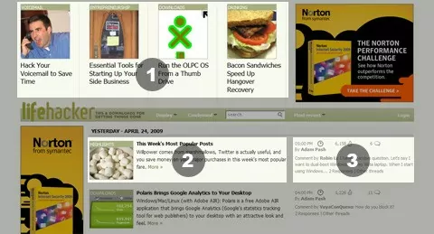
2. Lifehacker.com – Tips and Downloads for getting things done.
This is one type of design that is not really common online. Most themes and designs follow the header->menu->content->sidebar design. This on the other hand has several differences:
- Top Featured Articles. Lifehacker dosen’t lose time introducing you to the latest and hottest news and articles.
- Article Listing. There isn’t anything spectacular here. Each article excerpt has an image to the right and little text, but since there are so many articles here, the short info makes it easy to scan through and view just the ones that interest you.
- Latest Comment. Instead of putting ads in the right bottom corner, they chose to engage the users in the conversation. While most blogs display just the number of comments, they show you the latest comment on that article.
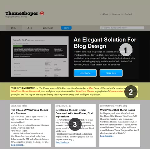
2. Themeshaper.com – a WordPress-powered thinking machine disguised as a Blog, home of Thematic, the popular and free WordPress Theme Framework.
I really like the new Themeshaper redesign. As Ian said in a blog post, there are several reasons why this design works! This kind of complex landing page makes for a really good introduction and urges the user to go deeper into the website.
- Featured product. This is the biggest thing on this page. It’s the first thing you see when you enter the website and you’re compelled to read about the product. There must be something good there, otherwise this wouldn’t be so big!
- The short description. Meant to introduce new users to the site it dose a good job attracting attention. The color difference make it stand alone and clear, even when there’s so much info around it
- The good, the bad and the ugly. Or more exactly “Must Read Ideas”, “Blog Design Tips” and “Recent Items From the Blog”. These are your introduction into the large article archive. From here you can navigate to different sections of the web-site and get your share of useful information.
As you can see what I’m really interested is a different content design, a landing page that will help users better navigate the entire web-site. The three web-sites I’ve presented are just a few. If you are looking for more great ways to arrange your content I would suggest taking a good look over:
- darrenhoyt.com
- outlawdesignblog.com
- problogger.net – there is a lot of content here, but somehow it’s manageable… the way color is used makes this possible
Now that I’ve done my homework is time to actually start arranging my content. I will come up with a wire frame shortly and hopefully you’ll be able to give me some feedback.
Related Articles
15+ Best WordPress Membership Themes in 2025
Looking for the best WordPress membership theme? We collected 20+ free and premium options, all of which make a great option for membership websites.
Continue Reading
Membership Page Design Tips & Best Practices
If you're new to subscription businesses, membership page design seems trickier than tackling a fire-breathing dragon. And you are not alone. The idea of creating effective membership page designs is far-fetched for many beginners. Because... Where do you even start? Starting or running a successful membership website is already tough as it is, let alone […]
Continue Reading
How To Create a Divi Membership Site
If you’re thinking of building a membership site in WordPress, you’ll need a solid theme and a membership plugin that pairs well with it. In this complete guide, we’ll show you how to create a Divi membership site using the popular Divi theme in combination with the Paid Member Subscriptions plugin.
Continue Reading

I’ve found that your thematic child themes are very hard to find once you are inside your site. I was looking for them on the top menu with no look.
Another thing, I think a landing page is very different from the home page, take a look at your statistics and see where are your visitor entering to your site. For me I think I always get here form links from Themeshaper or a Google search on thematic, maybe you would want to show a “welcome message” on the first page someone see, besides of your homepage.
Good look with your redesign, I’m learning here 😉
It seem I can’t see your blog comments form Chrome, I just see a white space where there should be comments
@Cokeramirez Thanks for your feedback. There are a lot of issues with my current theme. I know of most of them so this is why I need a redesign.
[…] Content design – what makes a good landing page […]
I think traditionally with blogs the idea is to have a sort of landing “header” that directs people to other parts of the blog, and displays the latest story, most popular articles, and so on below. The sites you posted are a good example of this, icondock.com is another good example. I tried this on my blog and got iffy results. I now have entire articles on the homepage, otherwise people aren’t clicking through to read them, and I’m driving traffic directly to another, otherwise people won’t click on the big link in the header that directs them to do so. I thought at first this was because my articles and auxiliary tab were rubbish haha but once I made these changes the numbers improved dramatically. Anyway tapbots.com has an interesting site where their homepage is just a landing page with their two iPhone apps, then some navigation links at the top that take you to their blog. This is a change from before when they had a two column layout with their landing header for their iphone apps on the right and blog on the left. This may only be applicable for sites that sell specific products, but I wonder if there is an application to blogs where you would hide your content from the homepage behind an entire landing page rather than just a header. The landing page would have to on point of course.
Hey Cristi,
Although I am a little late in writing this comment. I was thinking exactly the same, I want a little change in design of my blog theme too, within next few months I will contact you about it.
The following will be changed.
Addition of Featured Posts on top. (also check the top featured post at (htp://www.ibrokesomething.com)
Making the main page a bit different by adding articles a bit similar like the one on Lifehacker. This will only change the landing page(homepage), not the sidebar and other single page will remain same.
I will contact you next month about this change! Cheers! Keep up the good work.
PianoPlanet…
Megacool Blog indeed!… if anyone else has anything it would be much appreciated. Great website Enjoy!…
An amazing article. It’s nice to read a quality blog post. I think you made some good points in this post.
come up with a good website design.
One acknowledges that our life seems to be not very cheap, however some people require money for various stuff and not every person gets big sums cash. So to receive quick business loans or just term loan would be a right way out.